Wednesday, 23 June 2010

Art concepts in historical contexts symposium


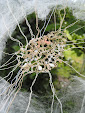
This symposium in Brighton was organised by the unravelled group and followed a morning at Preston Manor being shown their exhibition. The first speaker was Frances Lord, an independent curator, who had worked with Catherine Bertola on her exhibition at Nottingham Castle, she talked about her recent work. Lyndall Phelps spoke about her residency at the Natural History Museum store at Tring, where she studied specimens that had been stored in stately homes for safety during the war. Catherine Bertola talked about her work and inspiration. The image above is of Catherine Bertola’s ‘If she is not out as soon as I’ exhibited at Preston Manor – the title is taken from a lace tell.

Unravelling the manor house


This exhibition at Preston Manor by 12 artists in the unravelled group was an intervention inspired by the house and its artefacts. We were shown round the house by some members of the group who explained the inspiration behind the interventions, which were found in different rooms throughout the house.

The artists variously based their work on the owners of the house, the servants and the objects. The pieces I found most interesting were the two installations by Laura Splan, the pillow by Catherine Bertola, the screen by Emma Molony, the blood prints by Kira O’Reilly and the video and notes by Ingrid Plum.


In one of her pieces, Laura Splan had machine embroidered wording from the manor’s visitors’ guide on to two layered pieces of cosmetic facial peel. They were ‘framed’ by embroidery hoops and left on a stool as if just laid aside by the lady of the house. Her other intervention was a glove made in the same way left in a bedroom (Trousseau, shown here). Catherine Bertola’s ‘lace pillow’ was a pillow on a bed with pins sticking out of it as if they had been used to construct bobbin lace providing a play on words and contrasting the idea of the soft comforting pillow and the hard pins. Ingrid Plum’s installation in the same bedroom played out the narrative of the owner’s relationships, by combining a video of shadowy figures, sounds from the present day manor house and handwritten copperplate notes of unexpressed feelings.

Emma Molony’s work was in another bedroom and showed animations of the daily tasks of the servants superimposed on a screen (shown here). The animations were cleverly made and very delicate and also included humorous twists. The jointed models she had made were also shown and were for sale which made the piece more interesting. Kira O’Reilly’s blood prints in lace were in one of the bathrooms; they were attractive and appealed to me because of the lace but I wasn’t sure why the lace had been used.

This domestic setting served to show off the quirkiness of the exhibits in a way that would not have been possible in a white cube setting. It was also interesting to hear the artists talk about their work and inspiration.

The concise dictionary of dress


This exhibition at Blythe House, the museum store for the V&A, was an intervention by between fashion curator, Judith Clark, and psychoanalyst, Adam Phillips. They chose 11 words that were linked to psychoanalysis and dress, Phillips then wrote definitions for them and Clark produced the installations linking them to dress.

The whole experience was staged, you had to be escorted through the store in a group of seven people, each exhibit was revealed to you in turn and you were then given the definition of the word being depicted. This theatricality enhanced the experience and made it feel as if you were discovering the installations for yourself. The 11 words were: armoured, brash, comfortable, conformist, creased, diaphanous, essential, fashionable, loose, measured, plain, pretentious, provocative, revealing, sharp, tight, and the link between them and the exhibits was not always obvious, although they provided food for thought. However, in a discussion in the evening between the artists and Lisa Appignanesi at the London College of Fashion they revealed that Phillips’ words were prompts for Clark rather than absolute definitions of the exhibits. Likewise, they seemed to be prompts for the viewers and Robert Frost was quoted ‘look after the sound and the sense will look after itself’.

Thursday, 20 May 2010

Defining an exhibition


This conversation between fashion curator, Judith Clark, psychoanalyst, Adam Phillips, and Rebecca Arnold of the Courtauld Institute discussed The concise dictionary of dress. This intervention at the V&A’s reserve collection at Blythe House is a collaboration between Clark and Phillips. The idea came from thinking what would happen if museum labels were substituted. They chose 11 words that were linked to psychoanalysis and dress, Phillips then wrote definitions for them and Clark produced the installations linking them to dress. The project aimed to establish relationships between words and the language of dress. The words and clothing are mutually illuminating although they use different languages. Although it is interesting to consider whether the information given in the definitions usurps or aids the experience of looking at the interventions. An interesting point made was that histories are stored in our bodies and in the museum store and are not classified until they are exhibited.

Susan Collis exhibition


This exhibition entitled ‘Since I fell for you’ at the Ikon Gallery, Birmingham, showed some of Susan Collis’ older work and a new commission. In her earlier work she subverted the objects found in galleries during the setting up of exhibitions, such as overalls and ladders, by carefully embroidering ‘paint splashes’ on the overalls and inlaying mother of pearl ‘stains’ on the ladder. She is now collecting items from skips and refurbishment projects in is an effort to move away from items that have a relationship to domestic scale. The first room of this exhibition held her new commission, which seemed to be an unready and unprepared wall with rawlplugs, screws, staples and paint stains on it, however, careful inspection revealed they were carefully made of precious metals, gems and coral. The pretence that the gallery is not yet ready for visitors is also heightened by the installation of a bucket collecting dripping water in one of the galleries. In the catalogue she says she is now trying to introduce oppositions into her work such as dirty and clean, tidy and messy, and well crafted and un-made. She obviously likes dualities of meaning which is why she uses precious materials but in such a way that they appear quite ordinary.

Tuesday, 4 May 2010

Constructed space

Constructed space is the title of the most recent exhibition in which my work has been displayed; it runs from 12 April to 15 May. The venue is the Sunbury Embroidery Gallery which was purpose built to house the Sunbury Millennium Embroidery. Constructed space shows the work of four recent MA students from UCA Farnham.

Gail Baxter’s recent work on archives has led her to produce cubes of dipped thread and paper representing the gaps and absences found in archives. Ros Perton is a ceramicist whose stacked bowls employ a subtle range of glazes. Tracy Nicholls produces fine trellis panels of glass. Carol Quarini’s net curtains include messages in tambour lace that suggest the curtains have a voice and a mind of their own. What links the work of these four artists is their references to lace and the delicate shadows the work produces.

Walls are talking: wallpaper, art and culture


This exhibition at the Whitworth Gallery in Manchester uses wallpaper as a medium through which to criticise and subvert domestic culture. A byword for the neutral and overlooked, wallpaper in this exhibition gets the chance to redress the balance and show that it can shock, subvert and cause unease.

Much of the exhibition deals with historic wallpapers and how taste has changed, but I was more interested in the conceptual designs. It was interesting to see Robert Gober’s work, which previously I had only seen in books. His Male and female genital wallpaper and Hanging man/sleeping man were both shown but perhaps because I had seen images of them before they seemed familiar rather than shocking.

I found Abigail Lane’s Bloody wallpaper copied from images taken at a crime scene shocking because they were based in reality. At first glance you do not realise the images are copies of real blood stains but once you do they engender a feeling of unease.

Catherine Bertola’s Beyond the looking glass was very effective. The wallpaper seemed to be peeling from the walls and into the room and seen through an opening in the gallery wall made it appear even more three dimensional and life like.

I thought Conception by Francesca Granato in collaboration with Helen Knowles was a clever piece of patterning using stylised outline drawings of the male and female genitalia. It was more subtle and clever than Robert Gober’s more obvious drawings.

Erwan Venn’s animation entitled Destroy wallpaper shown in the image above was very entertaining. It started with an image of a wallpaper pattern made up of several components, which then seemed to slip down the wall and crash to the skirting board. The process was accompanied by the tinkling sound of crashing glass.

The exhibition showed that wallpaper can be more than a simple background wall covering. As it says in the catalogue ‘wallpaper obliterates the past. It covers up the cracks, the dirt, the evidence. It wipes the slate clean and enables new beginnings.’